Few things in motorsport ignite debate quite like a new-season livery launch. Before the very first lights go out, fans are already logging on to social media. They dissect colour schemes, design choices, and any changes made as if they’re discussing outfit choices at the Met Gala.
From heritage colour schemes and bold rebrands to “Ctrl+C, Ctrl+V” levels of consistency, this year’s grid offers a mix of tradition, risk-taking, and a few questionable choices.
With the new 2026 regulations promising a fresh competitive reset, liveries are crucial. They play a significant role in shaping teams’ identities and intent for the upcoming season.
Ready to throw my own hat in the ring, here is my definitive ranking of every team’s 2026 F1 livery, from underwhelming to unforgettable.
11th – Aston Martin
Has Aston Martin discovered the copy-and-paste function? Aston Martin has opted once again for the exact same shade of unmemorable teal. This color has cemented their identity as forgettable contenders. This consistency seems to be less about brand recognition and more about thoughtless repetition. It is much like their recent on-track strategies. The neon yellow rim accents are the singular redeemable detail. They inject a much needed spark into an otherwise forgettable design. Frankly, it is boring. In a season that seeks to mark a new era, Aston Martin feels firmly stuck in the old ways.
10th – Ferrari
Can I take this as a conclusive sign that Ferrari is single-handedly tanking Lewis Hamilton’s career?
Last year’s rich and striking burgundy undertones are gone. They are now replaced by a flatter scarlet red. This new color is interrupted by baseless splashes of white. To top it all off, the car is adorned with a variety of ugly sponsor logos. These slightly problematic logos look as if they have been carelessly stuck on to the car like bumper stickers. A question design pivot, or the beginning of the end? From a team like Ferrari with the visual legacy it possesses, it calls the latter heavily into question.
9th – McLaren
After securing back-to-back Constructors’ Championships titles and Lando Norris’ World Championship triumph, you’d think McLaren would attempt to cement their successful status with a new and improved livery. Instead, we were met with a near-identical copy of last year’s car. Whilst perhaps McLaren aims to send the message of “Hey, we won a championship with this livery!”, when you’re at the top, innovation should surely extend beyond the technical department.
8th – Alpine
Pink and blue return – slightly refined, but still familiar. Frankly, I’m slightly bored of this colour scheme. The clashing shades of pink and blue appear less aggressive than in previous seasons. However, Alpine’s general concept consistently struggles to leave a lasting impression. This is similar to their on-track performance.
7th – Racing Bulls
The colour palette works. The execution? Less so.
I’m a fan of the colour combinations used. However, has Racing Bulls’ livery really changed all that much since last year? There’s no fundamental issue here (unlike with Ferrari…), but there’s not anything particularly impressive, either. The livery is slightly biased towards the team. Racing Bulls’ livery edges dangerously close to being a less preferable version of their sister team’s car. For a team that created the Silverstone 2025 collaboration livery with Slawn, I expected better.
6th – Audi
Audi’s first full-season visual statement on the grid was marked by a bold monochromatic look. Neon accents punctuated the design. This cemented their intentions as a team focused on modernity and precision. However, their design was not as striking as it aimed to be, rendering the team forgettable in looks. As the season draws closer, perhaps their on-track performance will elevate the perception of Audi’s livery design.
5th – Mercedes
Keeping in line with tradition, Mercedes didn’t struggle too far from their livery last season. Mercedes chose one of the strongest colour combinations on the grid. It’s my personal favourite. They opted once again for their iconic colour combination of black, silver, and green. Yet, despite the solid foundations, the design failed to make its way into standout territory. It was unable to mirror what could be a dominant season for Mercedes this year. However, if 2026 proves to be a resurgent year on the track, this livery may age better than it debuts.
4th – Haas
Clean, sharp, and extremely effective. Haas have embraced simplicity, and honestly, it works. The 2026 car from Haas features a simple colour scheme. Its striking design promises that all eyes will be on Haas’ drivers. It is to see if their performance will stand out the same. The car has a purposeful, no-nonsense aesthetic. It parallels the chaos of other designs but comes out in front in clarity.
3rd – Williams
Refreshing shades of blue adorn Williams’ car this season. The pairing of cobalt and cerulean is harmoniously united in the team’s 2026 livery. Similar to Haas’ case, while the car is not as striking as other teams’ designs, sometimes simple is more effective. Williams have created an aesthetic design without complication. This leads me to wonder whether their performance this season will be just as steady. It also makes me question if it will be cohesive.
2nd – Red Bull Racing
Red Bull Racing stayed with a classic colour combination we know all too well. Their livery design reflects their steady performance trajectory over the last few years. Consistency can indeed be powerful – and Red Bull constantly proves it. The team’s classic colours of navy blue, red, yellow and black blend seamlessly with each other in this livery. They deliver exactly what fans can expect from the team this season. Fans can anticipate bold branding, thought-out tactics, and instant recognisability – even at speeds of 200mph.
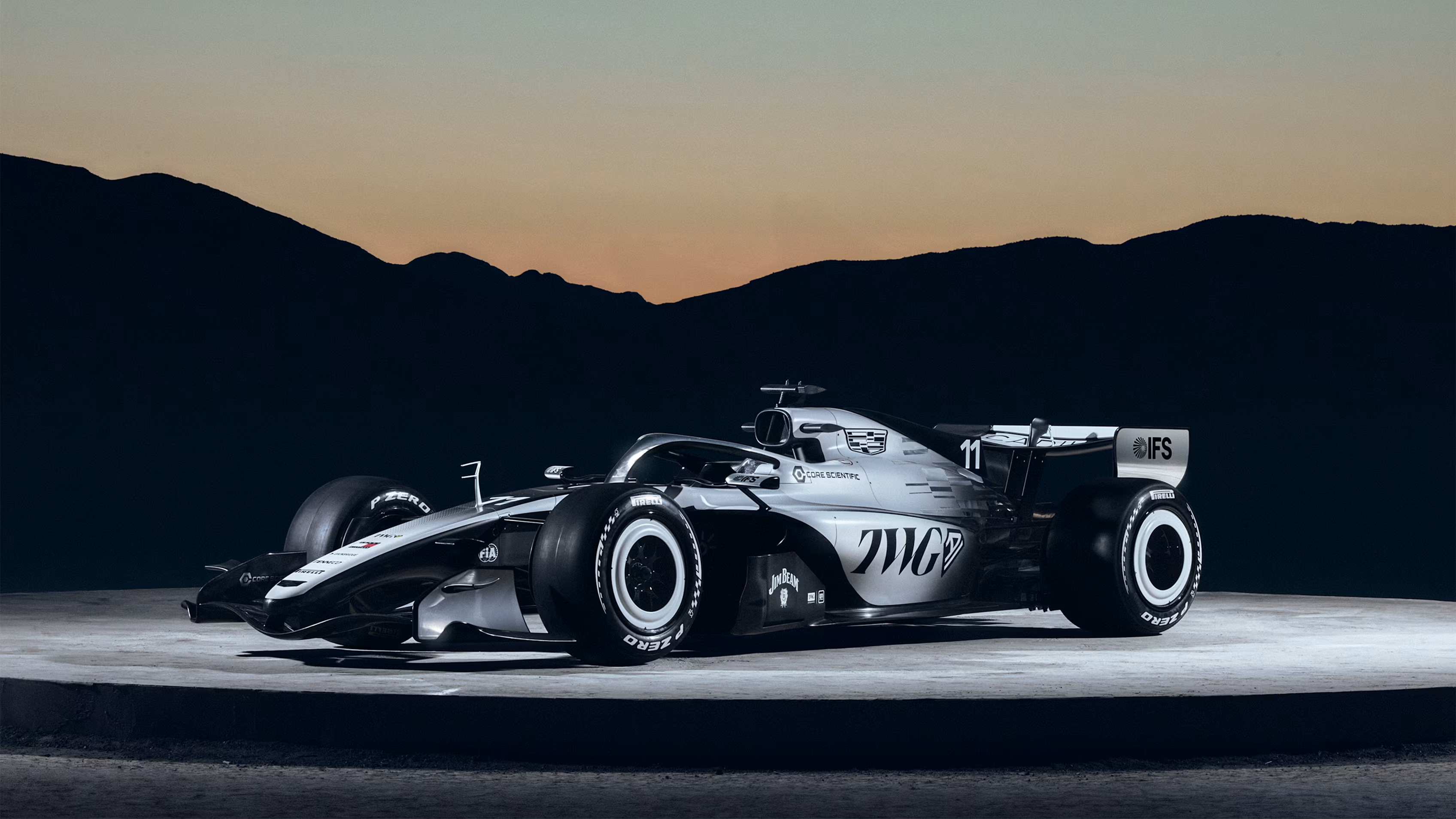
1st – Cadillac
Despite being the newcomers on the grid, Cadillac’s 2026 car has made a formidable entrance. With its monochromatic design, Cadillac has branded themselves as a team just as serious as the rest. Their sleek livery shows they are ready to show up on the track with both skill and style. The design feels deliberate, cohesive, and overwhelmingly mature. It isn’t flashy for the sake of attention, and exudes a not-so-silent power in its restraint. For a new team entering one of the most competitive grids in motorsport, Cadillac’s design signals a seriousness. If their performance matches this seriousness, Cadillac will undoubtedly be the team to watch this season.
Which F1 2026 livery tops your ranking? Let the debate begin.
Featured image credit: formula1.com
Edited by Alexandra.
Leave a Reply